 Ahmed Alaydi
Morshed Educational Platform
Production web frontend for a complete digital education ecosystem.
- Role
- Frontend Architecture & Development
- Timeline
- Production
- Industry
- Educational Web Platform
- Status
- Live
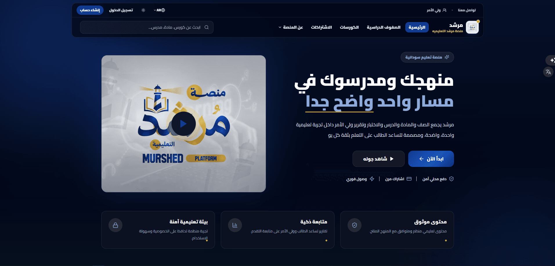
What this system is
Morshed is a digital education ecosystem rather than a course website. The frontend joins a structured curriculum, a standalone course catalogue, lessons and their media, assessments, subscriptions, and progress into one product — and then renders it differently depending on the account looking at it. The public surface presents the platform, its grades, its courses, and its subscription options; behind sign-in, a student reaches their own grade and entitled content while a parent reaches the students linked to their account. None of that content is hard-coded: it is read over REST from the Morshed Platform Management System.
What we needed to solve
Online learning products usually collapse into a catalogue of videos. A real school platform has to answer harder questions on every screen: which grade is this learner in, which subject and chapter does this lesson belong to, is this content included in what they paid for, how far through are they — and it has to answer them for a parent watching a child as well as for the learner.
How we shipped it
A frontend built around the curriculum tree rather than around a media list, with role-aware routing so student and parent journeys diverge after sign-in, entitlement checks in front of protected content, and progress carried through the learning path. It ships bilingual with full RTL/LTR layout mirroring, light and dark themes, and an image and loading strategy tuned for production delivery.
How the system is wired
The interface is organised the way the curriculum is, not the way a media library is. A student's path resolves downward through the tree, and every protected surface passes an entitlement check before it renders — which is why the same page can be a preview for one visitor and a full lesson for another.
The learner's stage, which scopes every subject, chapter, and lesson they can reach.
A discipline inside that grade, holding its own chapters and their ordering.
A unit of the subject, grouping the lessons that belong to it in sequence.
The teaching surface itself — video, description, related content, and the learner's progress state.
Engineering choices
In the wild
Hard problems, handled
One product had to present two substantially different journeys — a learner's and a parent's — without becoming two codebases.
Role is resolved once after authentication and drives routing and navigation, letting the shared curriculum, course, and lesson surfaces stay a single implementation.
Subscription-gated content risked being enforced only by not linking to it.
Access checks sit in front of protected surfaces, so entitlement decides what renders rather than whether a route was advertised.
Media-heavy educational pages are exactly the pages that get slow first.
Course, teacher, avatar, and hero images were given responsive sizing and modern formats, lazy loading below the fold, and a reviewed hydration and font-loading path to protect the largest contentful paint.
Static marketing figures on the landing page went stale the moment the platform grew.
Public statistics were rewired to the platform's own data — students, lessons, grades, subjects, courses — so the page describes the product as it currently is.
Built to stay fast
Design and interaction
Ready to ship and operate
What it does
A learner reaches only what belongs to their account: their grade, its subjects, the lessons and educational content inside them, enrolled courses, exams, progress, account settings, and whatever their subscription entitles them to.
Grade, subject, chapter, and lesson are navigable levels rather than tags. That structure is what lets the platform behave like an organised school rather than a shelf of unrelated videos.
Alongside the curriculum sits an independent course experience: browse the catalogue, open a course, read its details, discover its instructor, explore its content, and reach its lessons when entitled.
A lesson can carry a video, a description, related content, a progress state, its subject or course relationship, and the access rules that decide whether it opens.
Video is played inside the platform as part of the lesson rather than handed to the visitor as a file to take away.
Exams are part of the learning journey rather than a separate tool, tied to the content they test, to the learner's access permissions, and to their subscription.
The platform treats content as a path, not a playlist: a learner's progress through it is tracked and surfaced rather than left to memory.
A parent signs in to their own account, sees the students linked to it, switches between them, follows each one's progress, and reads the educational information available to them — a distinct experience, not a student view with a different label.
Student, parent, teacher, supervisor, and admin each resolve to their own navigation, pages, permissions, and content after sign-in.
Sign in, registration, session handling, password recovery, profile management, and role-based navigation once authenticated.
Smartphone, tablet, laptop, and large desktop all keep the same navigation, cards, content, and educational interface — without layout breaking or horizontal overflow.
RTL and LTR are layout directions, not a translation toggle: navigation, ordering, and directional elements mirror with the language rather than only swapping strings.
Backgrounds, typography, cards, navigation, forms, educational content, and hover and focus states are all defined for both themes.
Figures shown on the public pages are derived from the platform's own data — students, lessons, grades, subjects, courses — rather than typed in as static marketing numbers.
Why we chose what we chose
Build the navigation around the curriculum tree.
Grade, subject, chapter, and lesson are real levels in the data, so making them real levels in the interface keeps the URL, the breadcrumb, and the learner's mental model in agreement — and makes a lesson addressable by where it sits rather than by an id.
Resolve role after authentication, not per component.
Student and parent journeys diverge substantially. Deciding the route and navigation once at the boundary keeps every downstream page simple, instead of every component asking who is looking at it.
Gate protected content on entitlement, not on obscurity.
What a learner may open comes from what their subscription or purchase granted. Checking that in front of the content is the only version that holds once a link is shared.
Treat RTL as a layout concern.
Arabic is a primary language for this platform, not a translation of an English product. Mirroring the layout — navigation order, directional icons, alignment — is the difference between an Arabic interface and an English one with Arabic words in it.
Optimise media aggressively for the delivery context.
This platform is used on modest connections and mid-range phones. Course, teacher, avatar, and hero imagery were given responsive sizes and modern formats with AVIF where supported, lazy loading below the fold, and priority reserved for what is genuinely above it.
Results
The system that operates this platform
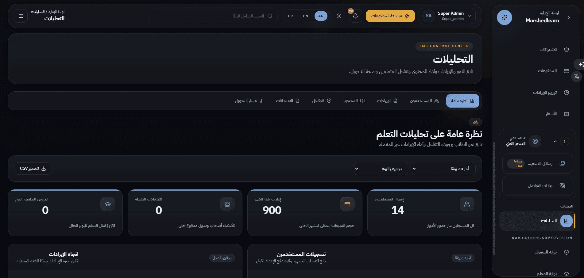
Every account, grade, subject, lesson, course, exam, package, and page of copy this frontend renders is administered in the Morshed Platform Management System, which ships as its own case study.
Other case studies

Building something similar?
Let's scope your platform — dashboard, mobile apps, APIs, the full stack.